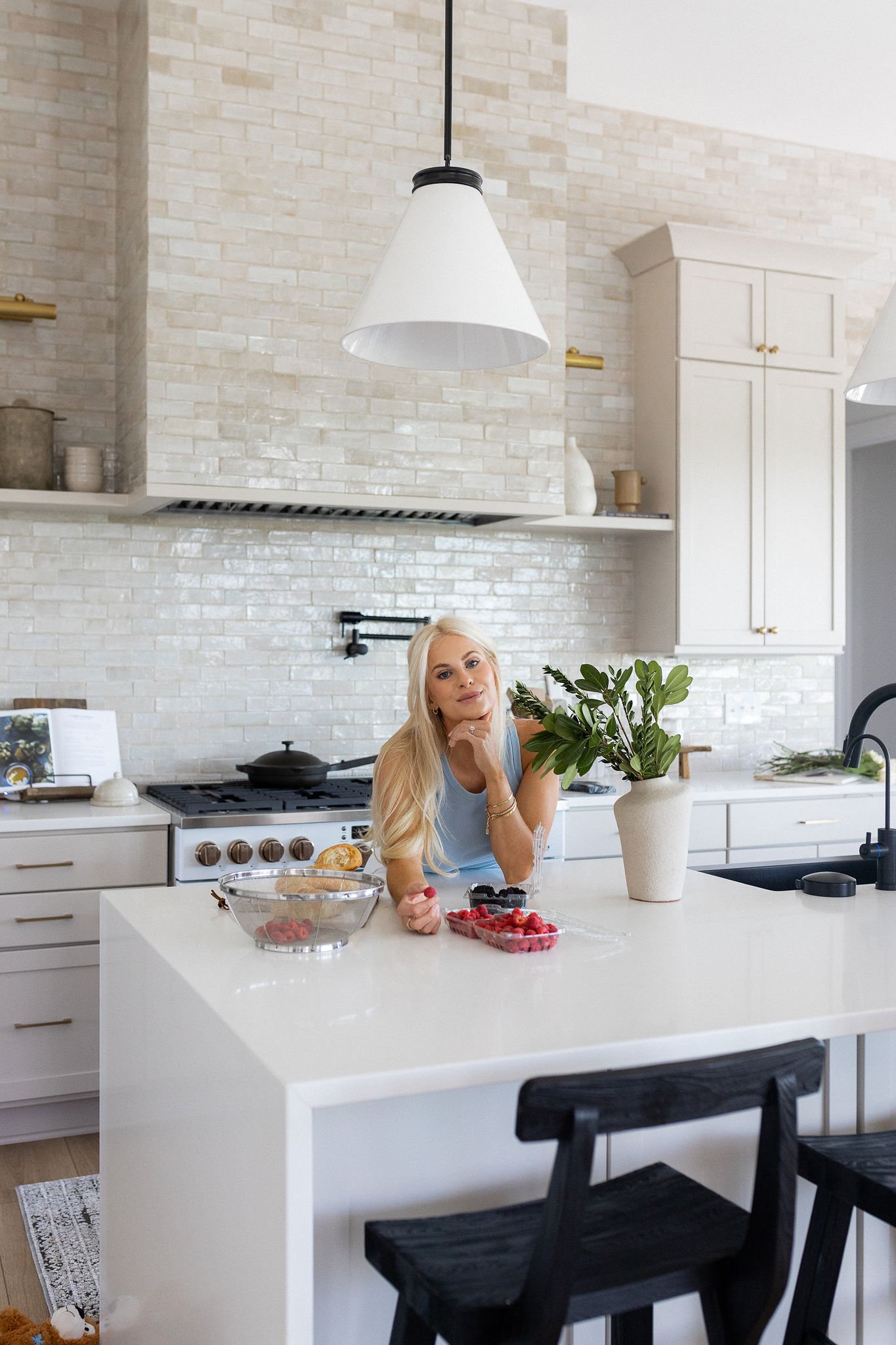
Paint Colors in Our Home
I’ve gotten SO many questions about what paint colors we used in our home. I know a lot of you are new home owners, or are in the process of building, or are just looking to spruce up your walls, so I wanted to break everything down for you - who knew selecting paint colors could be so hard! I mean, there are thousands upon thousands to choose from, so hopefully this helps the next time you have to decide on which shade of beige to go with LOL! All of our paint is Sherwin Williams because that is what our builder (Estridge) preferred. If you branch out to other brands there are, of course, even more options! Also, a lot of you have asked about ceiling and trim color. We chose to match the trim and ceiling to the wall color in each room and each color is at 100%.
I know I’ve gotten a ton of other DMs about home questions, so I’ll be sharing more as we go along plus everything is saved on my story highlights called House FAQ! Stay tuned for home home content!
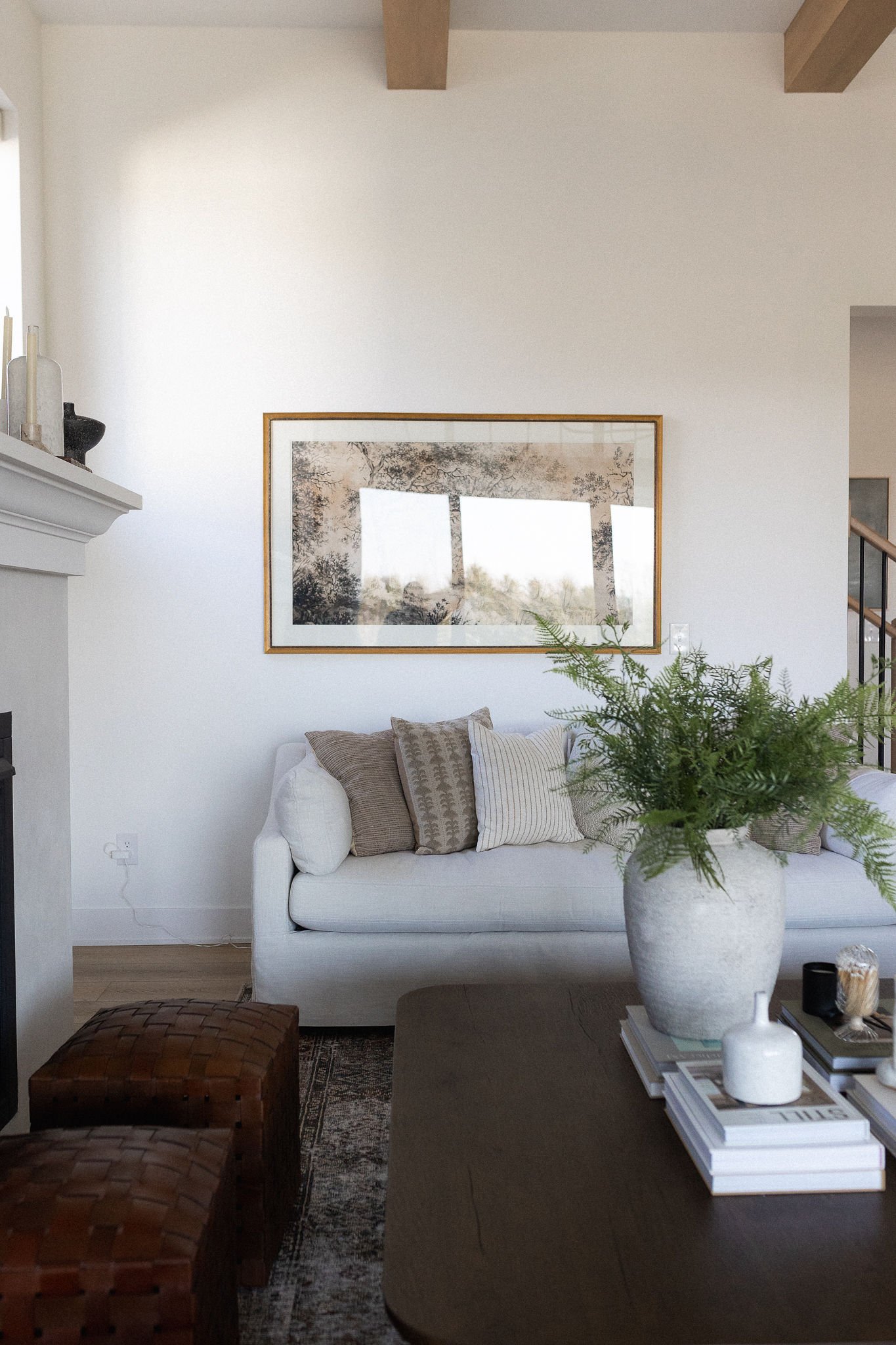
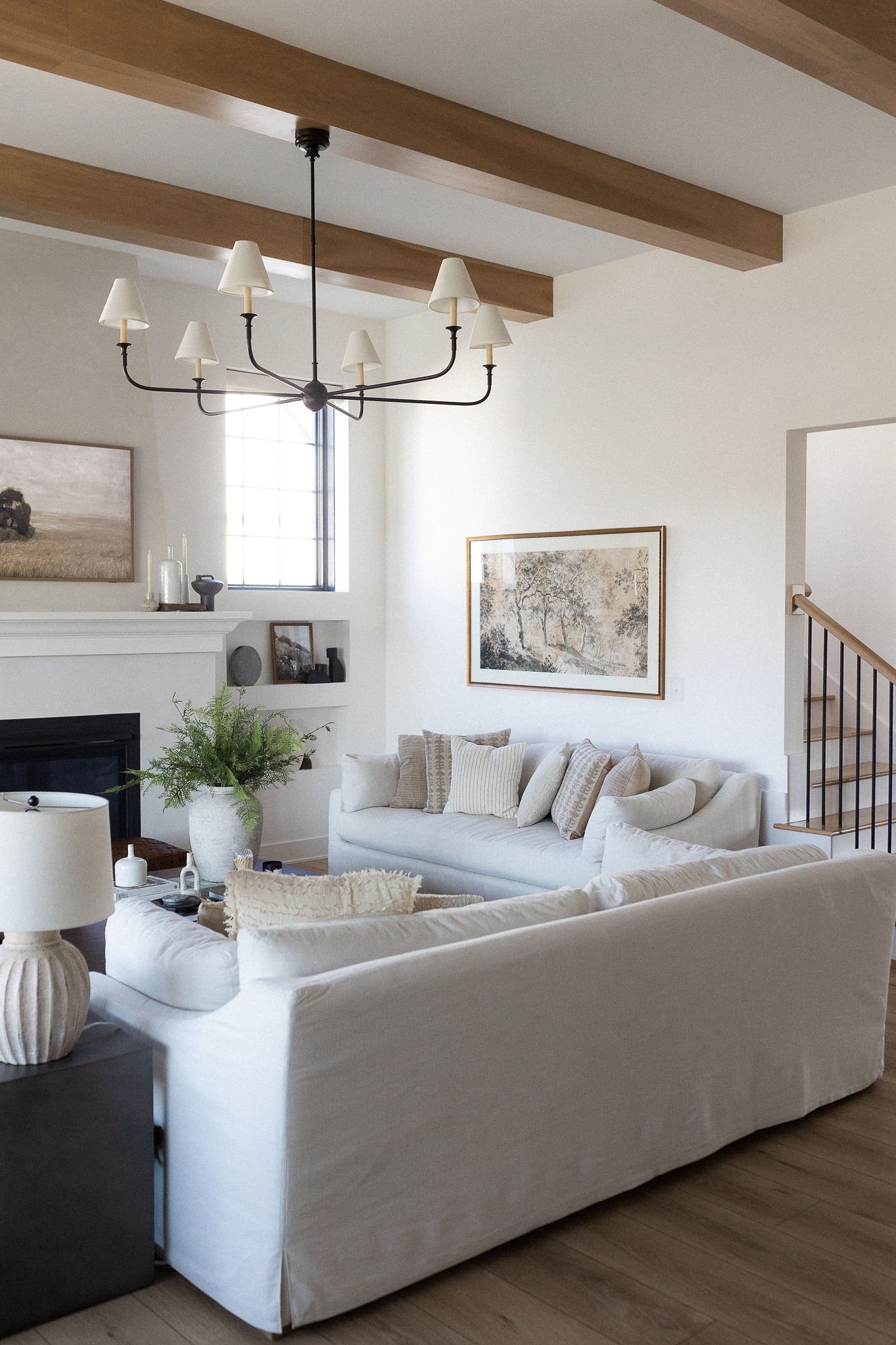
SNOWBOUND by SHERWIN WILLIAMS
Most of Our House
We used Sherwin Williams "Snowbound" on the walls, ceiling, trim and doors throughout most of the house. Picking the perfect white is very difficult! For me, I wanted a neutral white that didn’t feel too cool or too warm. Lighting is also a huge factor, so make sure to look at the paint throughout the day in different light, and in natural and artificial light. For example, did Extra White by SW in our last house, and it looked a little green in some lighting. We also considered Shoji White for this home, but it looked a little pink to me in some lighting! I did a question box on my IG and asked for your favorite Sherwin William whites and the top contenders were Snowbound, Pure White, Greek Villa, and Alabaster. It was a really close call between Greek Villa, Pure White, and Snowbound. Ultimately, Greek Villa felt a touch too warm for us and Pure White felt a touch too grey… again, lighting plays a huge roll! We are so happy with Snowbound. It’s bright and doesn’t pull any undertones of yellow or green. I read this on Maison de Pax blog, and I feel like she said it perfectly: “As a soft white, Snowbound actually leans neither blue nor yellow, but more of a true light gray or even a tiny hint of greige (though not a very warm one), which means that it can often reflect the tones around it. It can read as crisp white without feeling too cold.” … this is exactly how I feel!! Love it!

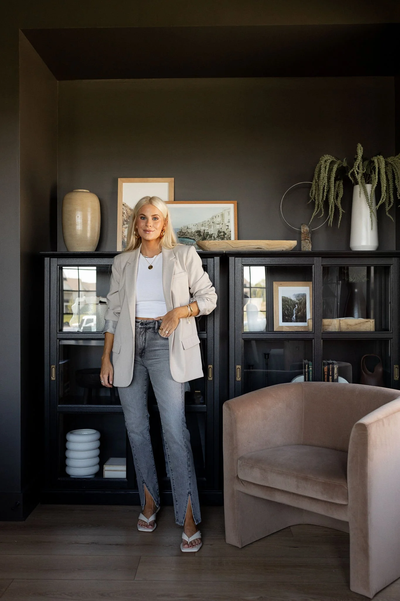
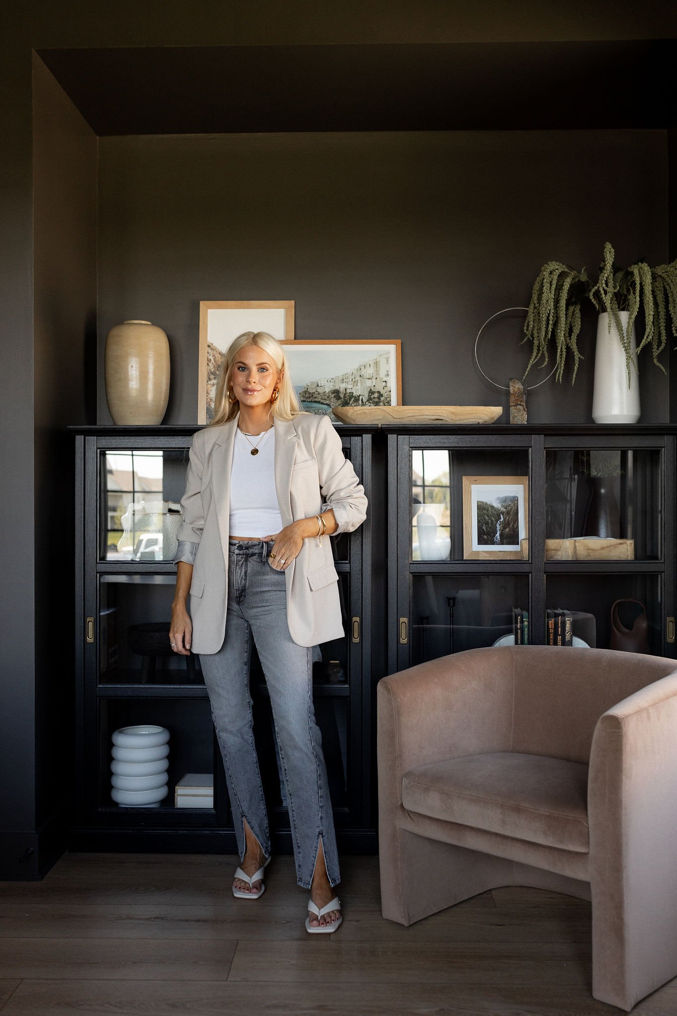
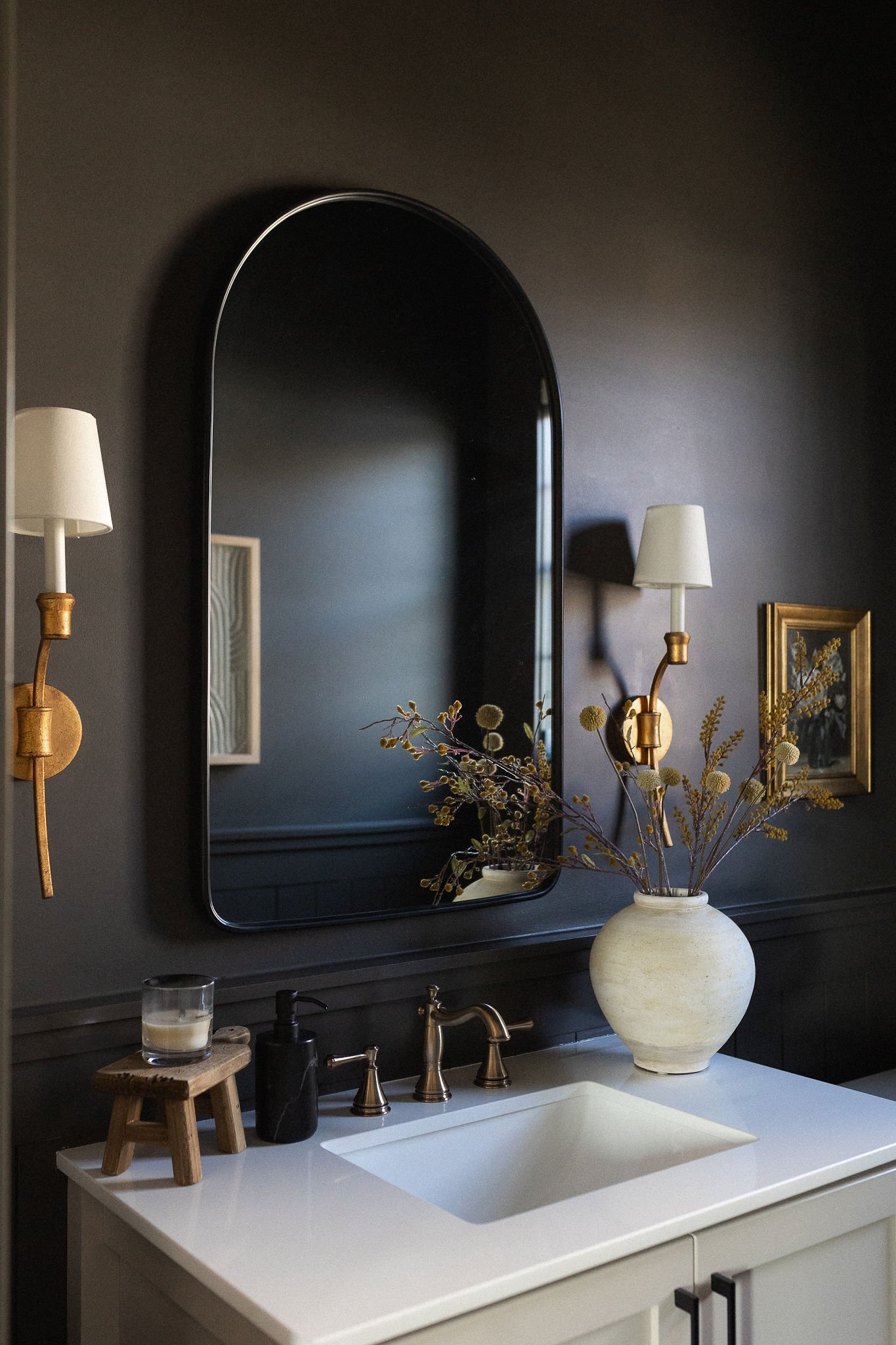
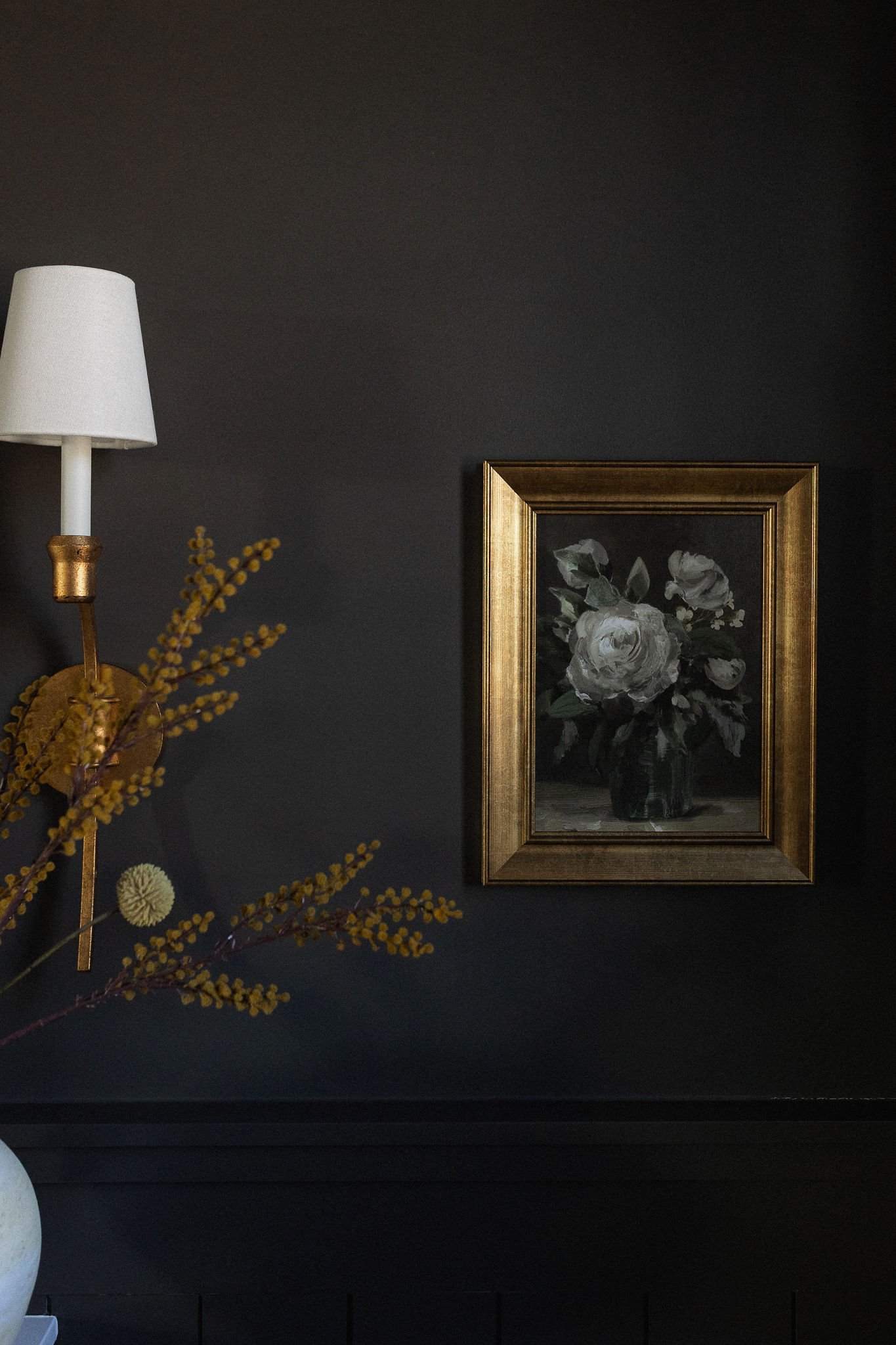
URBANE BRONZE by SHERWIN WILLIAMS
Cort's Office
Sherwin Williams "Urbane Bronze" - painted on the walls, ceiling, trim and door. This color was recommended to us by our designer, Jenny, and we immediately loved it and didn’t even consider any other colors! Urbane Bronze is SW’s 2021 color of the year, so it’s super popular (for good reason) and you’ll probably see it all over! It’s the perfect earthy, moody color and sometimes it looks like a dark brownish gray and sometimes, it can even look a like a dark green. I feel like it kind of transforms throughout the day and and night it almost looks black! I couldn’t love it any more than I do!

Powder Bathroom
Sherwin Williams "Urbane Bronze" - we loved this color so much that we decided to also use it in the 1/2 bath next to Cort’s office! This is the bathroom that people will use when they come over, so we wanted it to have a cool vibe. We added shiplap halfway up the wall and painted Urbane Bronze on the walls, the shiplap, ceiling, interior side of door and trim. (We’re playing around with some of the hardware and faucets and we need a mirror, so it’s not finished just yet!!). The vanity in here are Accessible Beige, which I’ll chat about more below!

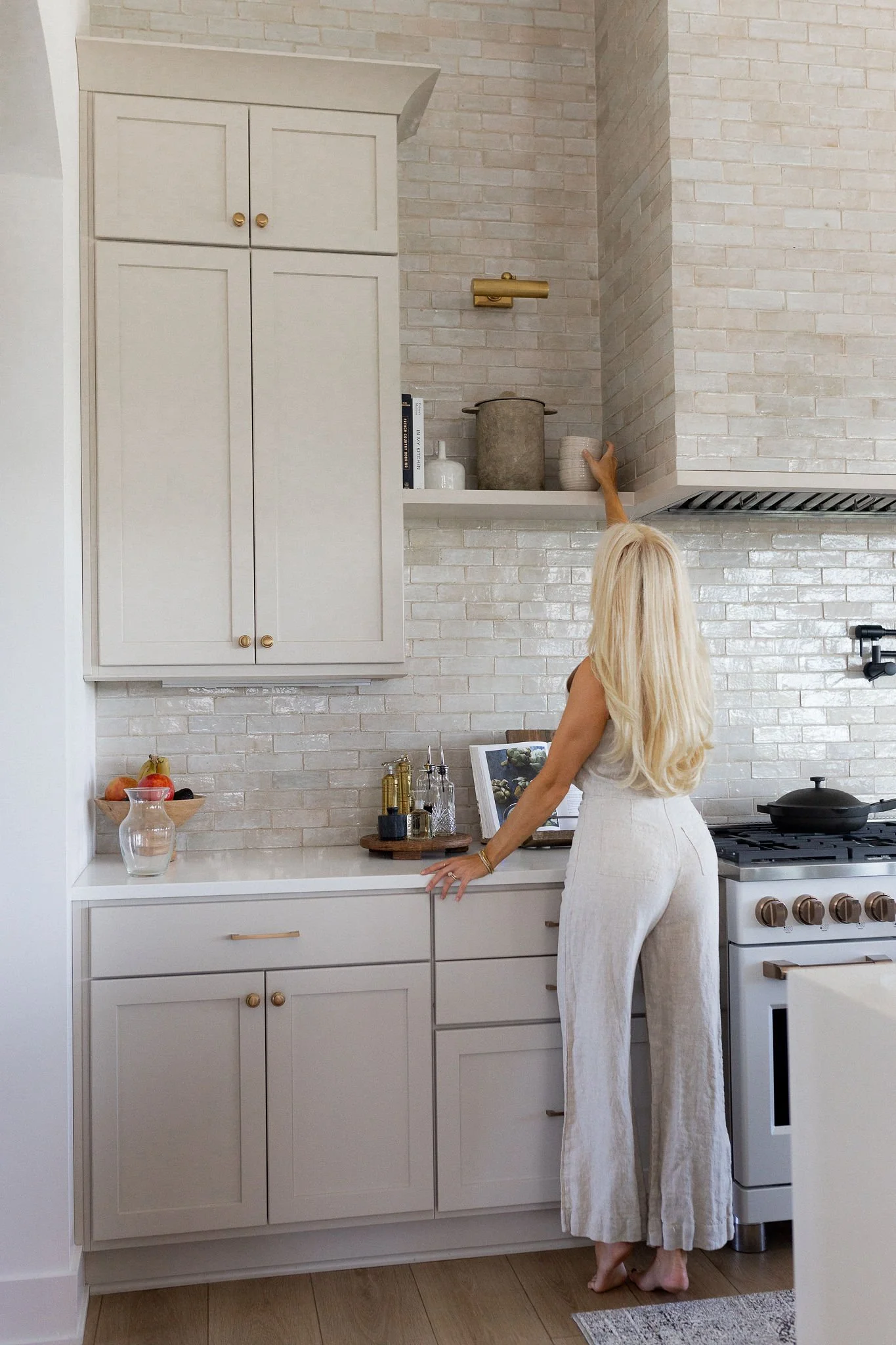
ACCESSIBLE BEIGE by SHERWIN WILLIAMS
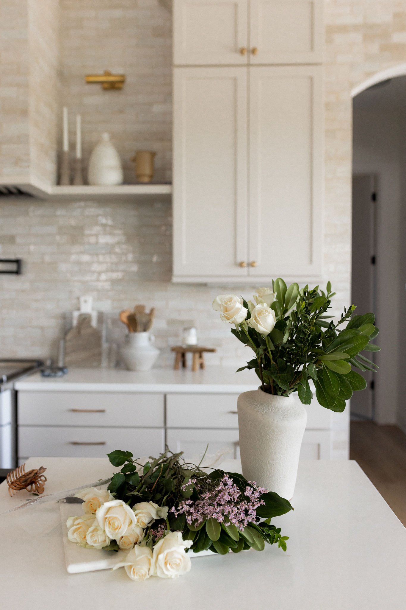
Kitchen Cabinets
Picking out cabinet color was super tricky and one that we went back and forth on so much!!! I wish everything was as easy as the Urbane Bronze decision lol. We landed on Sherwin Williams "Accessible Beige" - I am absolutely thrilled with how it turned out! We knew we wanted a warm beige tone and wanted to make sure they didn’t look too light (like a white or cream) and didn’t want them to look too dark (like a dark tan or brown) and also wanted to make sure it didn’t look yellow. There were a lot of factors to consider here such as how the cabinets would look next to our floors, the tile, and our counter tops. The main concern was making sure that the cabinets looked good next to the flooring because we didn’t want the warm tones to clash. We spent a lot of time staring at the floors and paint colors together different light! We also considered Shiitake and Worldly Gray for the cabinets. Ultimately, Shiitake was touch too dark (almost brown) and would stand out / contrast more than we wanted and Worldy Gray was a little too cool and grey looking for us. When I first saw the cabinets, I was so happy with our choice... Now that the tile is finished, I’m even more thrilled with how it looks! The color looks great in natural light, artificial light, and when it’s dark! All around, just love it!
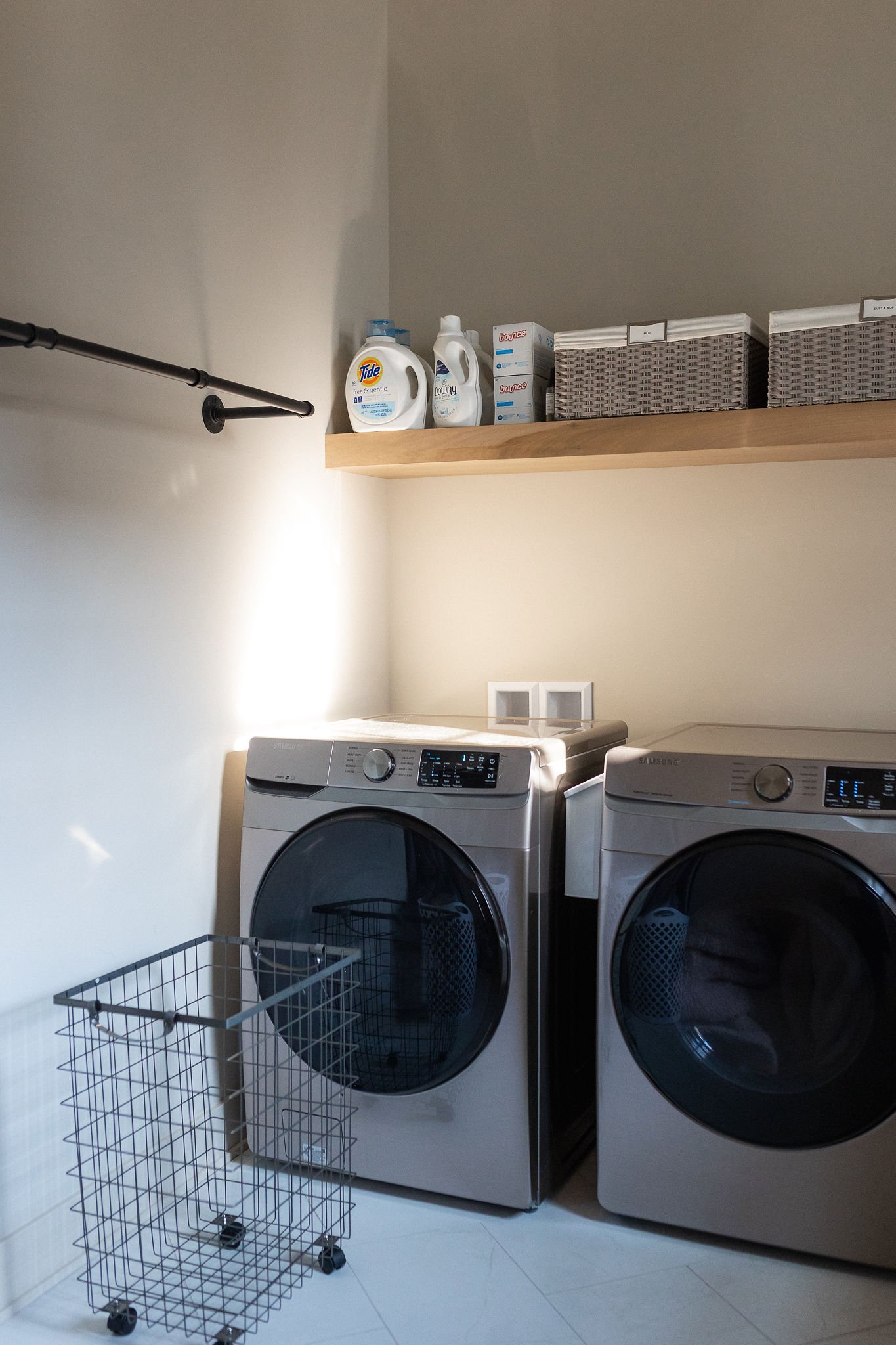
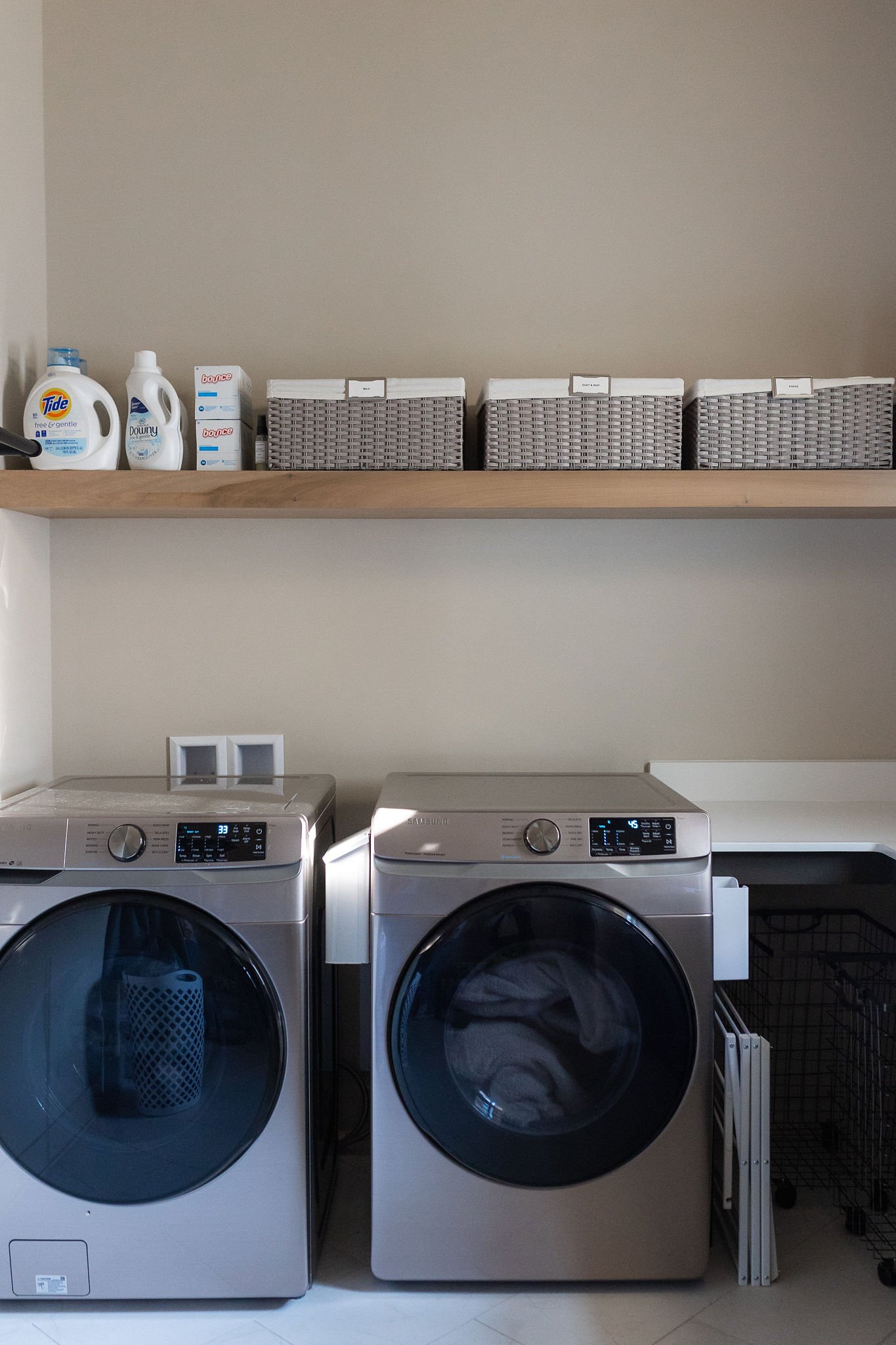
Laundry Room
We also went with Sherwin Williams "Accessible Beige" in the laundry room/ dog wash area and it is painted on the walls, trim and ceiling. OKAY so I’m bound to have one regret, right?! I’d say this is the one room that I don’t LOVE how the paint color looks. It’s funny because I absolutely love how the Accessible Beige looks in our kitchen.. but in the laundry room, it looks a little bit more yellow and darker. It makes sense because there is not as much natural light in here. When the sun is streaming in, I like the paint color, but at night or on a gloomy day, it’s not my favorite. I also wonder if the color just looks different on a cabinet vs a wall because I still like the way our kitchen cabinets look when it’s gloomy/ dark out… so I’m not really sure but I think my advice would be to use this color in a big, open space and not a smaller room.
If there had to be a room that I don’t love the paint color, I’m glad it’s this room ha! It’s just the laundry room, so it’s not that big of a deal… and it’s not like I HATE it, I just don’t love it. Maybe it’ll grow on me, or maybe someday I’ll change it but honestly, I’m just so happy to even have a laundry room!!! Also the cabinets in here are Urbane Bronze by Sherwin Williams.

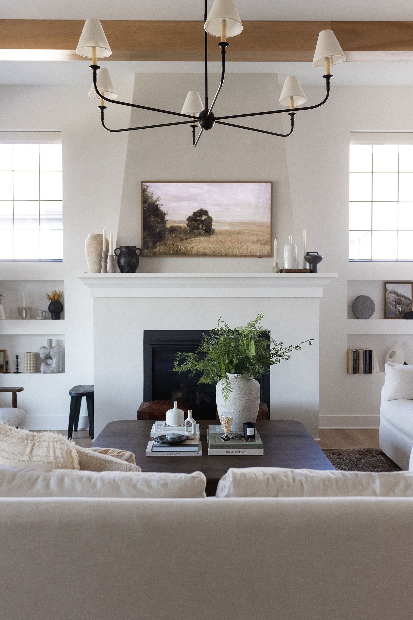
SAINT SAVAUNT by PORTOLA PAINTS
Living Room Fireplace
For our fireplace we decided to do a roman clay texture finish in the color Saint Savaunt by Portola Paints. We originally had Snowbound by Sherwin Williams underneath and painted right on top of it! We found someone locally who does this, David Studley, and I reached out to him via direct message on Instagram here.
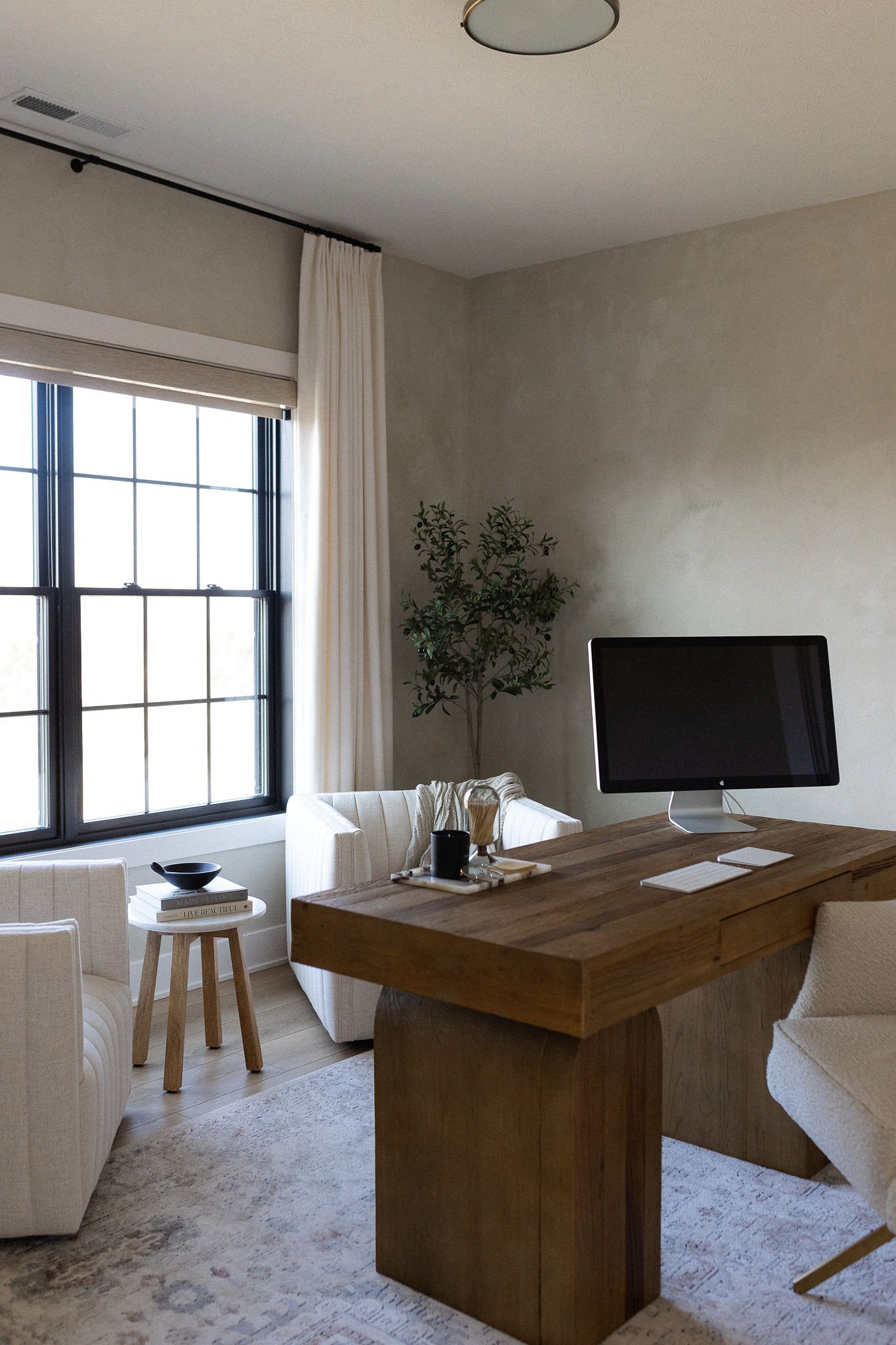
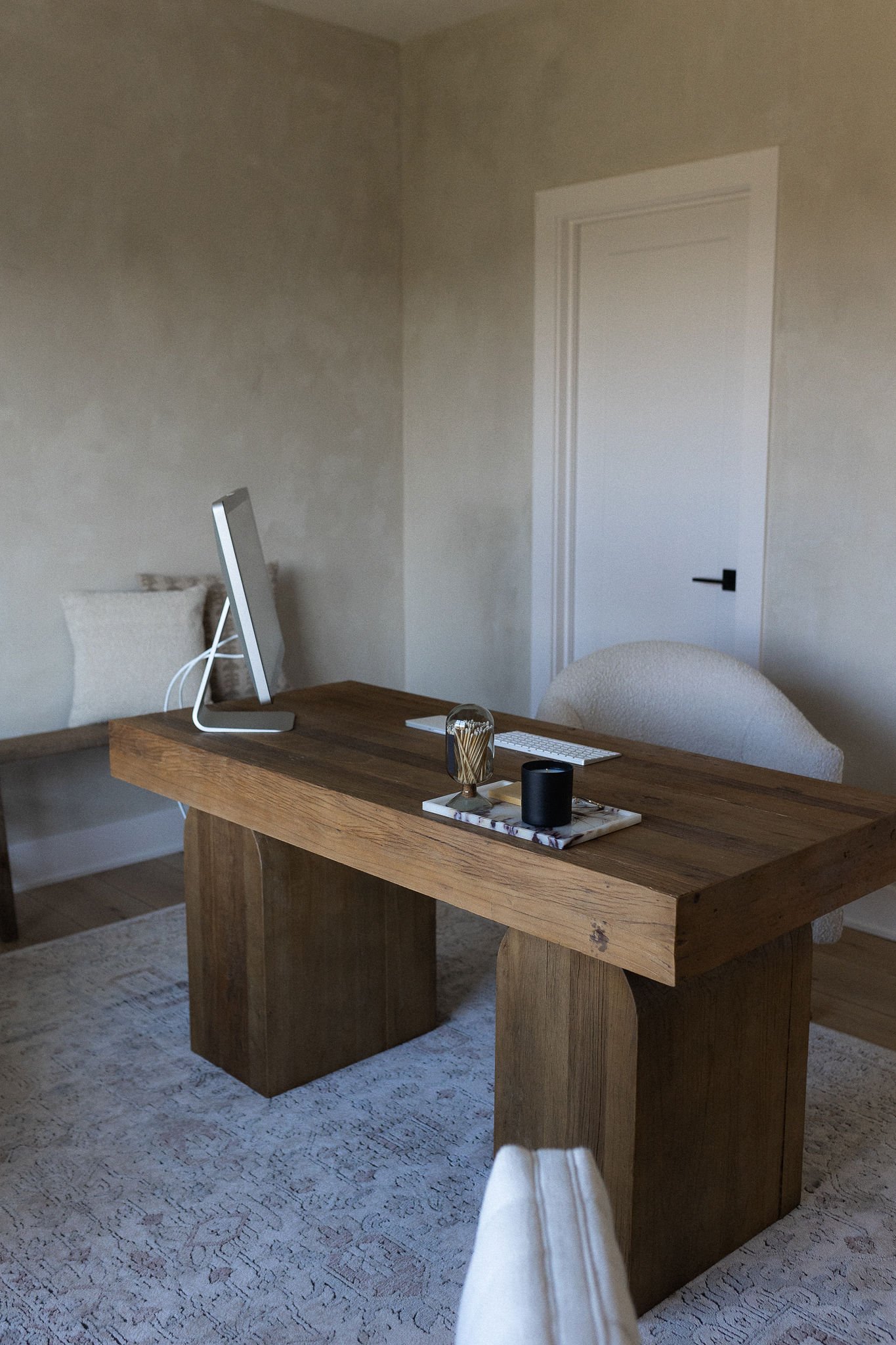
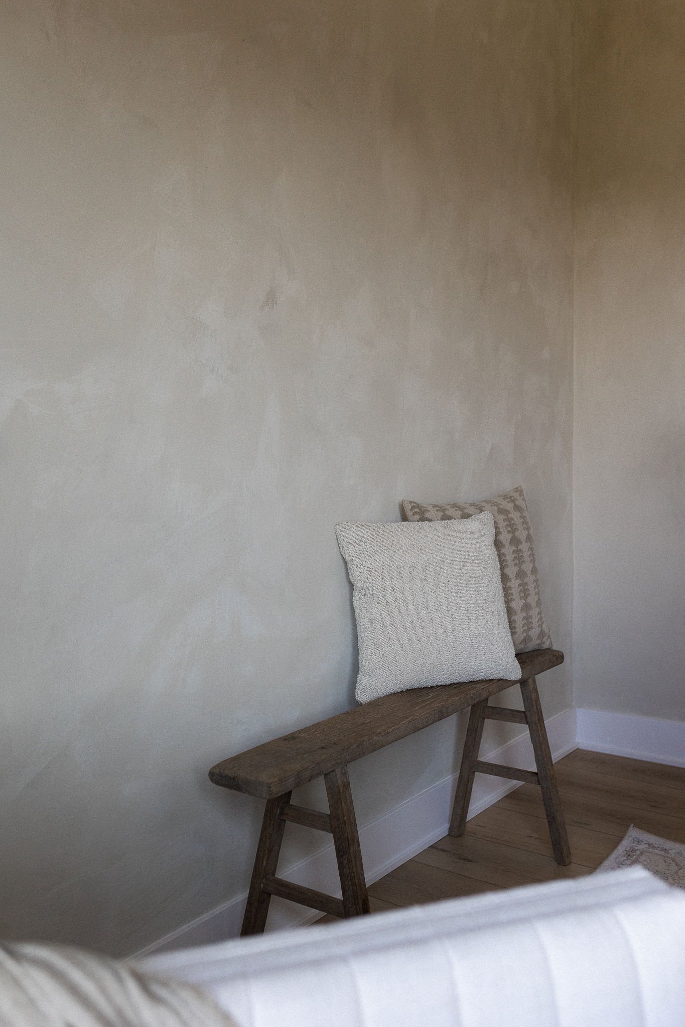
KINGDOM by PORTOLA PAINTS
My Office
For my office we decided to do a limewash texture finish in the color Kingdom by Portola Paints. We originally had Snowbound by Sherwin Williams underneath and painted right on top of it! We found someone locally who does this, David Studley, and I reached out to him via direct message on Instagram here.
Okay guys, those are the paint colors throughout our house!! I didn’t share pics, but our cabinets in our butler’s pantry and 2 of our guest bathrooms are black, but it’s just a black that our cabinet maker had and it’s not an exact paint color so I figured it wasn’t worth sharing!
As you can see, we kept things pretty neutral, which I think they’ll age well - didn’t want anything too trendy and decided to go with the classics! Hope this helps if you’re deciding on paint colors anytime soon :) … I can’t say I’m envious of you LOL glad this process is over!!!